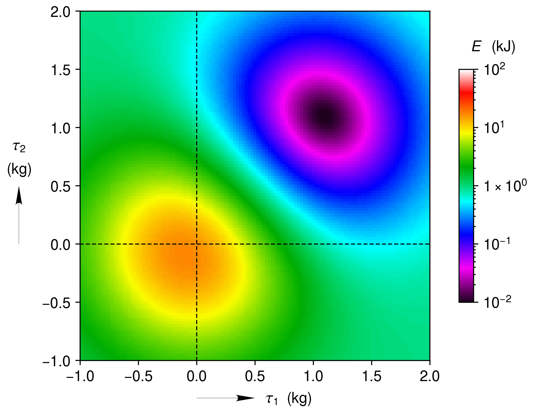
Intensity Map with a Log Scaled Color Bar
Intensity map (heatmap) plotted as an image. The intensity values are converted to colors using a logarithmically scaled color bar.
import clearplot.plot_functions as pf
import numpy as np

#Generate the data
delta = 0.025
x = np.arange(-2.0, 3.0, delta)
y = np.arange(-2.0, 3.0, delta)
X, Y = np.meshgrid(x, y)
Z1 = np.exp(-X**2 - Y**2)
Z2 = np.exp(-(X - 1)**2 - (Y - 1)**2)
Z = (Z1 - Z2) * 2
Z = 5.0 ** Z
Z = Z - np.min(Z) + 0.01

#Plot the matrix as an image
pf.plot_intensity_map('intensity_map-log_scale.png', X, Y, Z, \
    x_label = [r'\tau_1', 'kg'], y_label = [r'\tau_2', 'kg'], \
    x_lim = [-1, 2], x_tick = 0.5, y_lim = [-1, 2], y_tick = 0.5, \
    c_label = ['E', 'kJ'], c_scale = 'log', c_lim = [1e-2, 1e2])